In-house project for my secondary business, Treerock Therapy
My roles: Designer, Full-stack developer
My roles: Designer, Full-stack developer

Treerock Therapy is my secondary business through which
I offer counselling therapy and career counselling predominantly to tech professionals and academics.

I approached the project of designing and building the website for Treerock similarly to how I would approach any other client project. The work was divided into the following stages:

I approached the project of designing and building the website for Treerock similarly to how I would approach any other client project. The work was divided into the following stages:
- Background gathering: Design inspiration and brand definition
- Logo design
- Page design for the home and a content page
- Website coding for the desktop
- Cross-device and cross-browser optimization
- Animation design and coding
- Additional content page creation
The brand and the logo
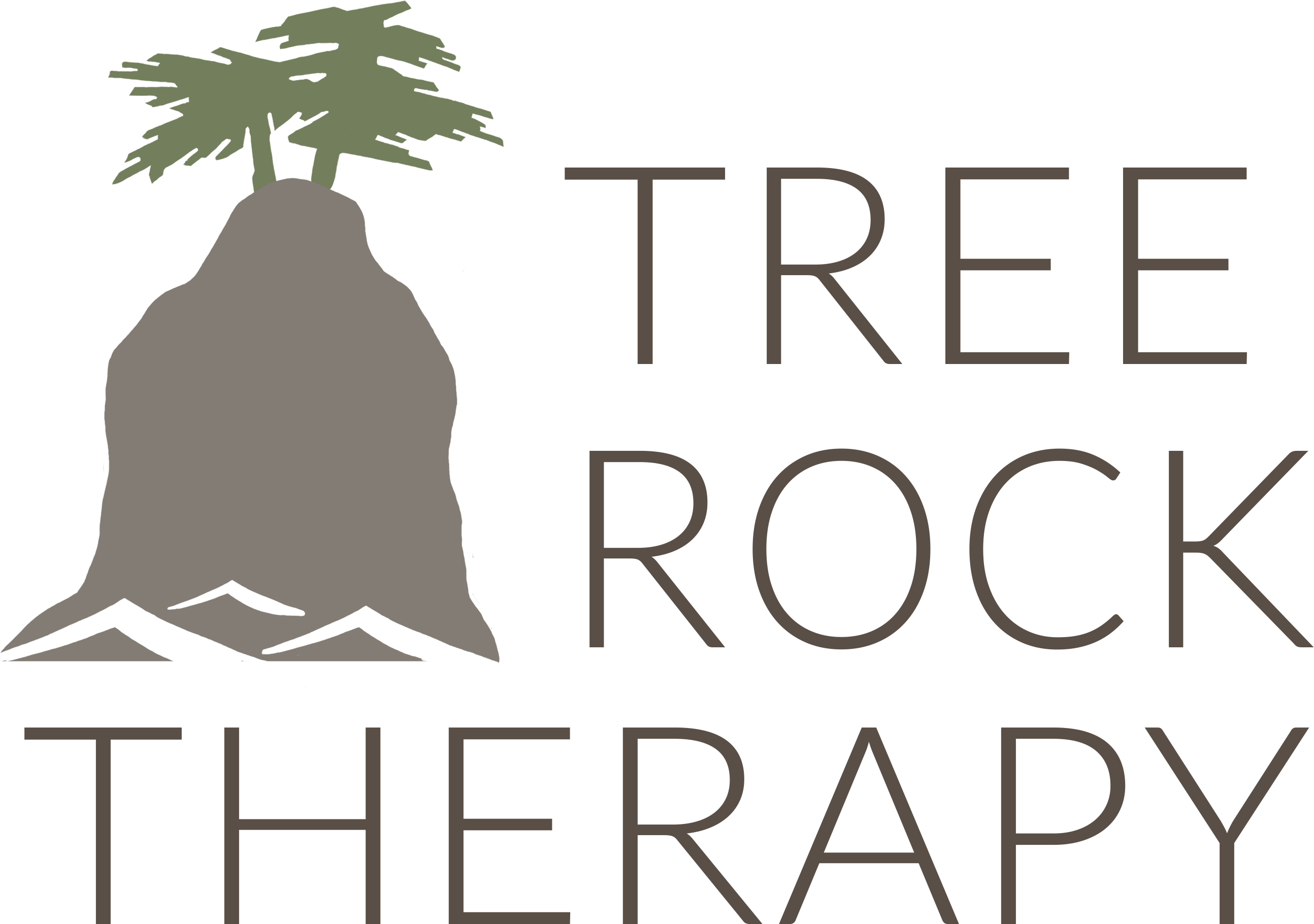
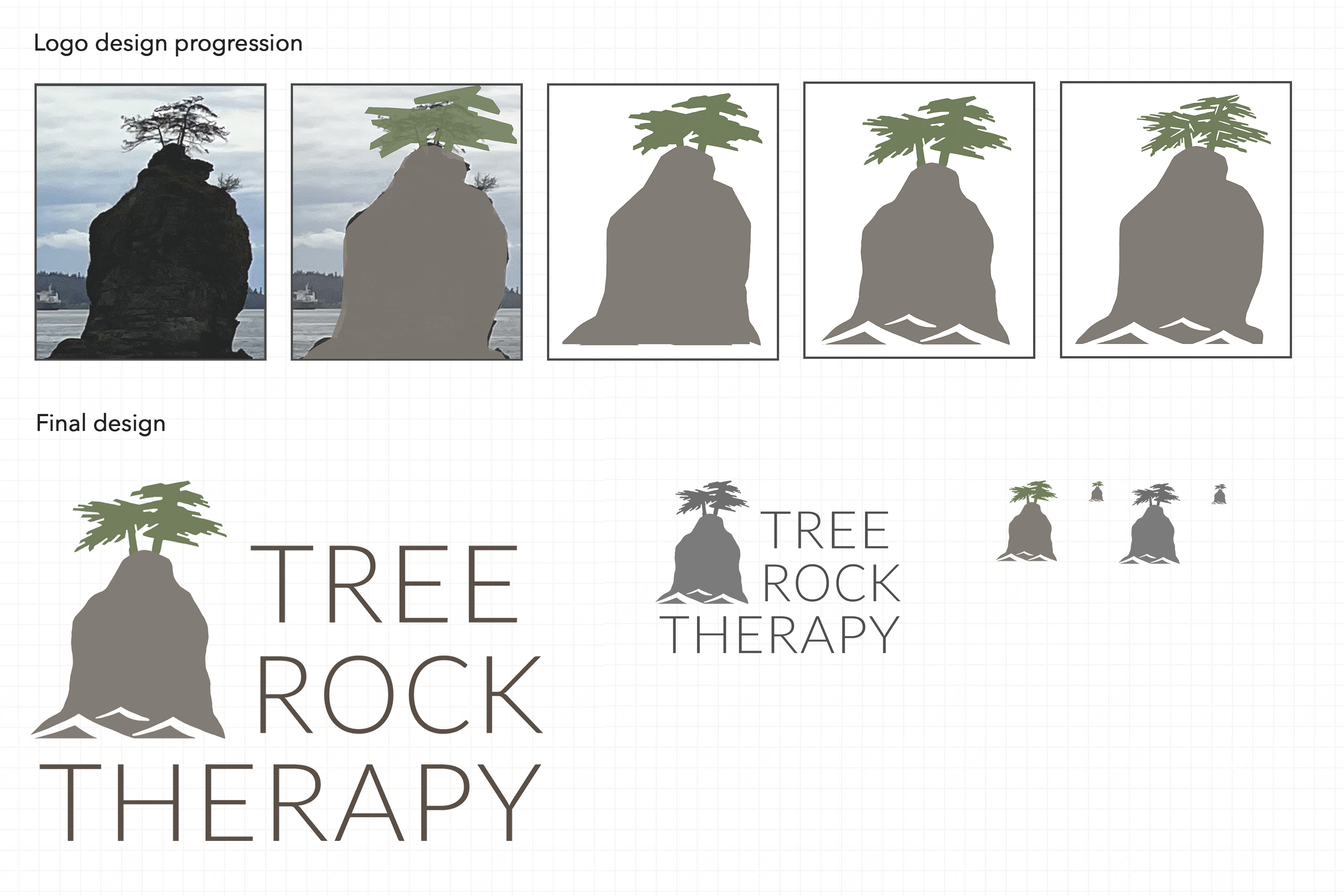
After doing market research, identifying my market niche and creating a business plan (all these tasks would normally be done by a client), I defined the following keywords that the website needed to convene to visitors as its branding message: Calmness, Warmth, Minimalism.I consider a logo to be the most memorable face of any business and the first design step was thus to create one and establish further inspiration for the design of the website. The logo for Treerock depicts a particular place in Vancouver that is personally meaningful to me, the Siwash rock. The logo uses natural and relatively low-saturated colours in order to fit with the branding message. I started with a real-life photo and did a number of design iterations where I added and removed complexity until the logo looked well on a website and also as a small image on (potentially grayscale) documents:
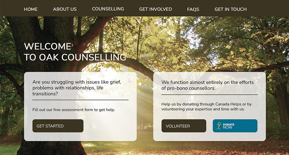
Home page and content page design
The keywords of Calmness, Warmth and Minimalism needed to be strongly present in the design of the website. Following the style of the logo, all colours have low saturation and the palette makes use of natural shades of brown and green in combination with white and grey. The design hues, contrast and font sizes are balanced to help a visitor concentrate on important text of a page, while creating a large background space with light, page-wide graphics and images.
Cross-device, cross-browser coding
Since many potential clients view websites on their mobile phones, tables, laptops and desktops of varying screen sizes, it was important to make sure that the website flowed well and read well on all of these devices.Four main device categories with unique layouts were identified, each having its unique needs:
- Large desktops, such as 27" iMacs: The text needs to intelligently position itself to make reading easy and the rest of the space should to be filled with images of appropriate sizes.
- Standard desktops, 13" - 23": Majority of the screen needs to be utilized for text, but enough space should be given to images.
- Tablets and phones in landscape orientation: Similar to desktops, but margins and text need to be smaller to utilize the screen space better. The main menu and multi-column layouts need re-adjustment.
- Phones in portrait orientation: Very narrow screens where all content should flow in a single column, with appropriate font sizes.

Final touches and content
Animations, including a parallax effect, reactive button motion and content section fading, added a depth to the website. Consistent with the graphical style of the website, animations are subtle and there is a balance between fast (distracting) and slow (boring).The animation work was done before more pages were created, because it was likely that some HTML / CSS code would need to change in order to animate various elements.
Once a basic home page was created and tested, I split the code up into various PHP and JavaScript components and built more content pages using meticulously crafted text copy and carefully selected stock images. Some styles needed to be adjusted, especially to fit longer content pages such as the FAQs page.
I performed final cross-browser testing on a number of browsers and devices including a 27" iMac (Safari, Firefox, Chrome), a 23" Windows PC screen (Edge, Chrome), a small MacBook screen (Safari, Chrome), an iPhone, an iPad and an Android phone.
You can view the final result on the published Treerock Therapy website.

